PROXXIMOS: Building a tech healthcare brand from the ground up to become an industry leader
Proxximos is a virtual health system that is on a mission to see a world largely free of communicable disease. They provide digital tools that track communicable diseases, and acting as a digital vaccine, these tools stop the spread and protect workplaces and communities.
The Challenge
Proxximos required visual designs to help them stand out from their competitors, while presenting their values associated with the brand and its products.
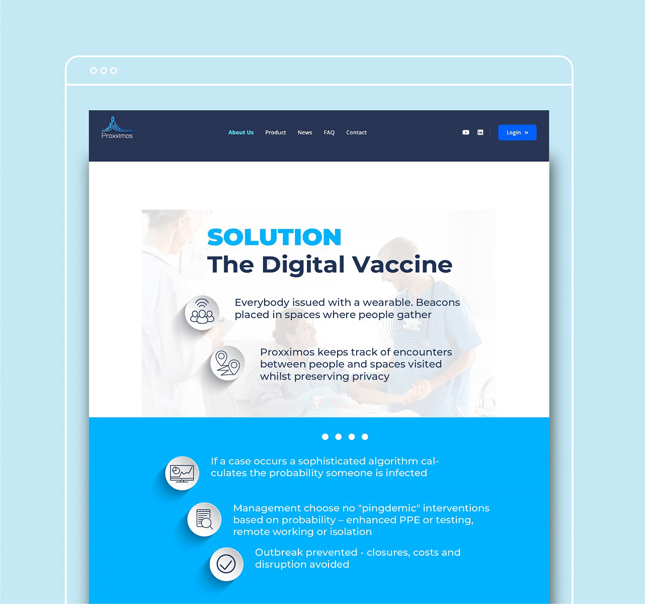
We needed to create material for investors and clients alike. Showing the complexity of the system, while breaking it down to demonstrate the simplicity of use.
Clarity was crucial for Proxximos to become the national brand that they envision to be. If not now, they would miss the opportunity to become pioneers in virtual health system at a time when healthcare workers really need support.


The Impact
The collaboration allowed Proxximos to find clarity in their business. This helped the team move forward in full alignment with the company’s goals, leading to new investors and clientele.
Together, we built Proxximos’s brand from the ground up, helping set a foundation to grow as a national brand in healthcare. And the new brand identity shows Proxximos as the world class, virtual healthcare providers that they really are.


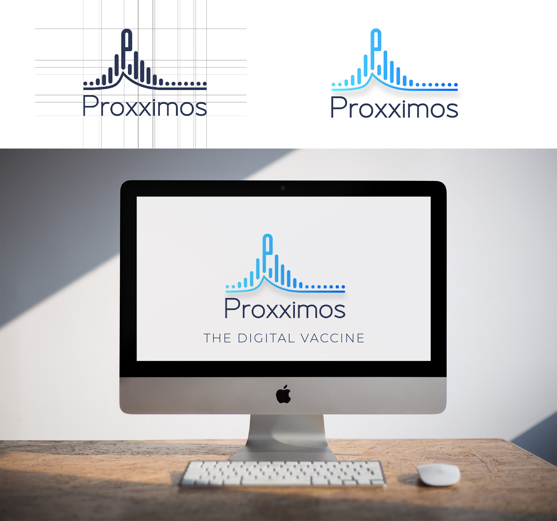
The Brand Identity
Working on the logo specifically, we kept in mind the concept of time, and how Proxximos reacts. The peaked letter ‘P’ paints the emphasis on the height of a disease, and how, when Proxximos engages, it reduces the spread, and keeps control.
Because we’re appealing to decision-makers with regards to healthcare, we wanted a colour palette that was respectable, clean, fresh and unique. We used dark blue and light blue as the main colours of the brand but added a bright royal blue accent. This blue became a touch to the brand experience that is an intriguing pull to make the consumer want to learn more.
The visual identity reinforced the industry leader that Proxximos is. Without forgoing this foundational goal, we opted for this particular typeface that was clean yet still friendly and inviting. We wanted to communicate that despite their technology and excellence, Proxximos is still a humble, welcoming, and human-centered brand.

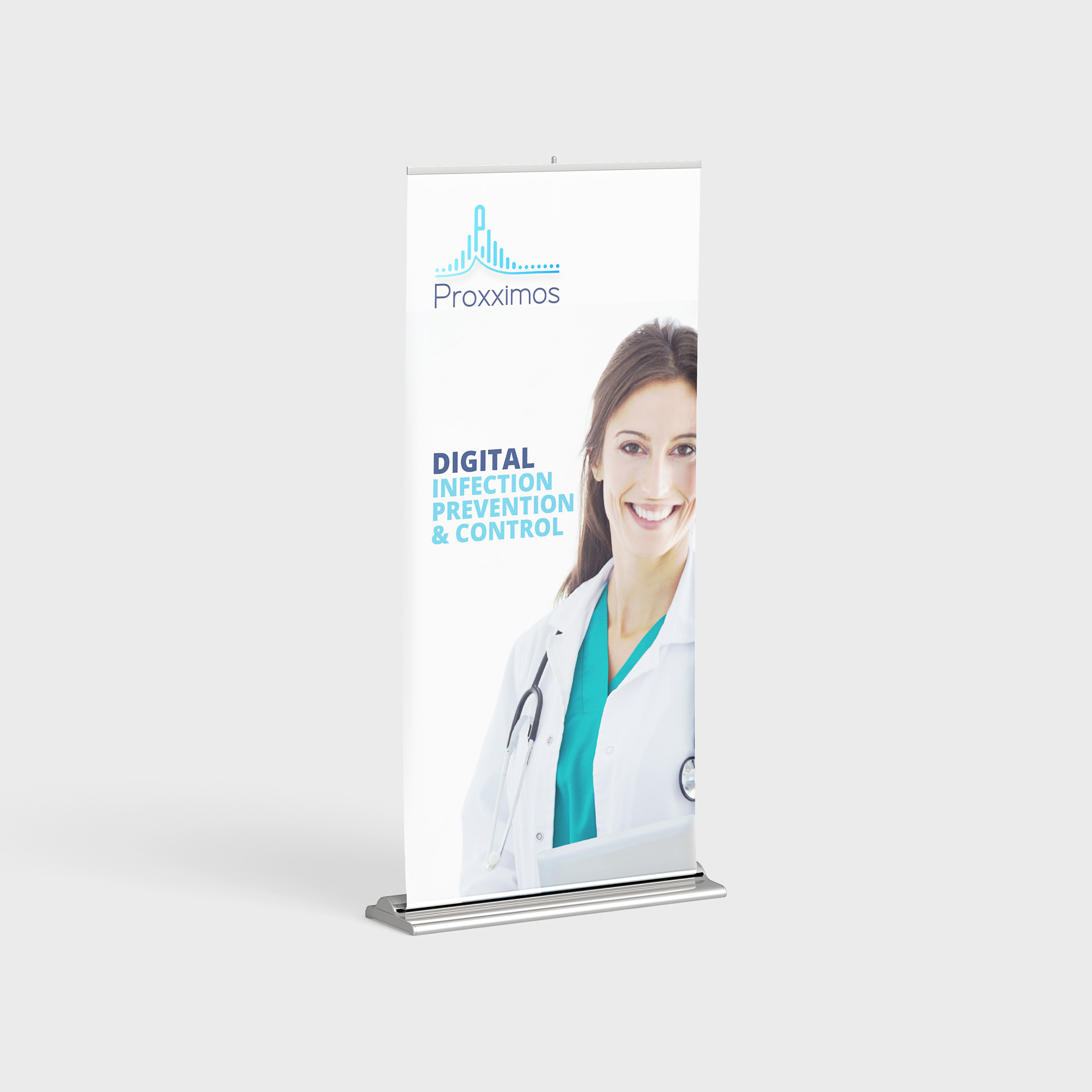
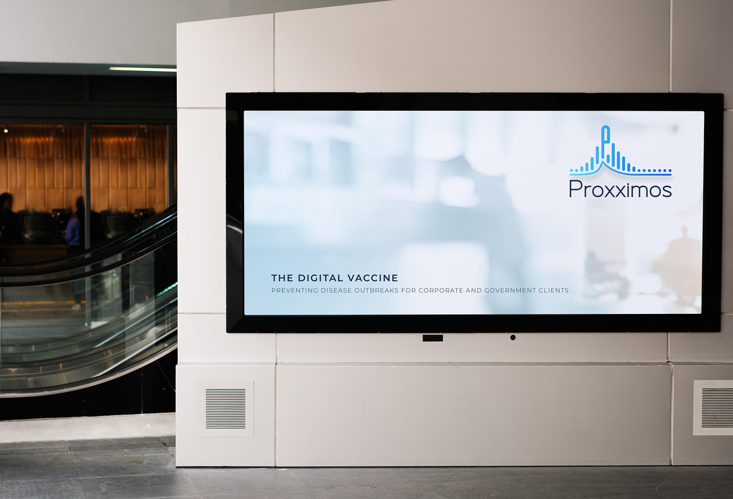
The Campaign
To create brand awareness, we created a national ad campaign for Proxximos based on the new brand identity. The campaign highlighted the different sectors that Proxximos serves in the healthcare industry.
I worked closely with the creative director to design a unique tagline and concept for each sector. We incorporated the actual reality that the medical professionals are facing and emphasize the human-centered aspect of the company culture. We then used these concepts to outline video content to expand the campaign beyond the display ads.